This study aims to compare different control charts to monitor the nosocomial infection rate per 1,000 patient-days.
METHODS:The control charts considered in this study were the traditional Shewhart chart and a variation of this, the Cumulative Sum and Exponentially Weighted Moving Average charts.
RESULTS:We evaluated 238 nosocomial infections that were registered in the intensive care unit and were detected by the Committee for Nosocomial Infection Control in a university hospital in Belo Horizonte, Brazil, in 2004 and 2005. The results showed that the traditional Shewhart chart was the most appropriate method for monitoring periods with large deviations, while the Exponentially Weighted Moving Average and Cumulative Sum charts were better for monitoring periods with smaller deviations of the mean infection rate.
CONCLUSION:The ability to detect nosocomial outbreaks was improved by using the information provided by all three different control charts.
The quality control of products and services is a worldwide concern. In the beginning of the 20th century, Shewhart control charts1 were introduced to evaluate the quality of manufactured products. In the health care arena, the use of control charts was initially proposed by Deming1 (1921) and Juran1 (1951), but they were not used in hospitals in the United States until 1988. Currently, control charts are widely used to identify and control nosocomial infections because they provide hospitals with statistical evidence of outbreak occurrence.1,2
The Clinics Hospital of the Federal University of Minas Gerais (CH/UFMG) has 467 beds and approximately 19,200 admissions per year (according to data from 2005). It is a high-complexity hospital; therefore, the occurrence of nosocomial infection outbreaks is one of the main concerns of the Nosocomial Infection Control Committee (NICC) of the CH/UFMG. Since 2003, the NICC has been using Shewhart control charts with modifications proposed by Arantes3 to monitor nosocomial infections and detect possible outbreaks, using charts that were built with only the data obtained from the previous year. This method of constructing control charts has been a cause for concern because outbreaks occur very frequently, and these control charts could be slightly affected by year-to-year variations.
This study presents the results of a comparison of three control charts that were applied to routine data obtained from the epidemiological identification of nosocomial infections based on information collected by the NICC-CH/UFMG.
MATERIALS AND METHODSThe data were analyzed using the following control charts: (1a) a traditional Shewhart control chart;4,5 (1b) a Shewhart control chart with modifications proposed by Arantes;3 (2) a Cumulative Sum (CUSUM) chart;4,5 and (3a) an Exponentially Weighted Moving Average (EWMA) chart4,5 with parameters L = 2.814 and λ = 0.10 and (3b) an EWMA chart with parameters L = 3.054 and λ = 0.40.
The Shewhart control chartA control chart is a statistical tool that is used to study and control repetitive processes. The term “process” is very general. A process could be related to categories such as manufacturing, consulting, and health services. The concept of a control chart is simple: samples are collected sequentially from the process, and the observed values of a variable of interest are compared with so-called control limits. These limits define a region where the sample values (or their average) are expected to be found for the process to be considered under control. The limits are estimated using appropriate statistical tools. The Shewhart control chart is the most famous of this type of chart and is used to monitor the parameters of variables using sample data collected in distinct periods.
In this study, Shewhart control charts were constructed in two ways: (a) using the complete series of observations to estimate the limits while considering the normal distributions of the variable of interest (the traditional Shewhart control chart)4,5 and (b) using only the observations of the previous year to estimate the control limits, based on the Poisson distribution (the modified Shewhart control chart, as proposed by Arantes).3
Building a traditional Shewhart control chart4,5Let x1,x2,…,xn be the sample observations of the variable of interest (X) from a normal distribution, where n is the sample size. The Shewhart control limits for the average of X are given by:
where
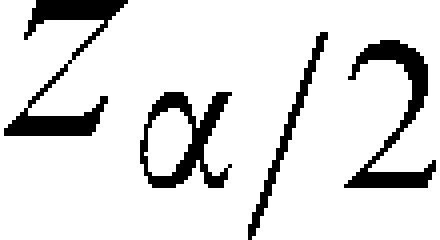
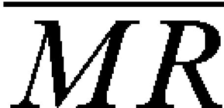
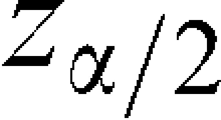
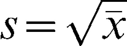
, is the sample mean and is a value from the standard normal distribution such that the area above it is is the moving range mean; 1.128 is a correction value;5 and α% is the false alarm rate, which controls the percentage of sample observations that will randomly fall outside the control chart limits (above the UCL or below the LCL). A very common value is 3 which under the normal distribution corresponds to a false alarm rate of 0.27%. That means that in the long run 0.27% from the observations plotted in the chart are expected to fall out of the control limits even if the parameters of the process remain unchanged. The quantity (/1.128) is an estimate of the standard deviation of the variable of interest (X). In this study, the value = 3 will be used.The values of the variable of interest per unit of time and the control limits are placed on the chart. Statistical instability (indicating that the process is out of control) is indicated when sample points are observed higher than the UCL or lower than the LCL.
Building a chart as proposed by Arantes3The Shewhart control chart is based on the assumption of a normal distribution, which is not valid for counting processes. Usually, Poisson or binominal distributions represent the exact distribution of the variable of interest in these situations. A correction proposed by Arantes,3 called the modified Shewhart chart, is based on the approximation of the Poisson distribution for the normal distribution. The chart consists of five limits, given by:
where is the estimate of the standard deviation of the variable of interest (in the case of a Poisson distribution, the mean and the variance are equal).The chart is built by plotting the sample values of the variable of interest per unit time and the parallel lines (center line, alert and control). Statistical instability is present if any sample point exceeds the control limits or if two consecutive sample points are on the same side of the center line, either above or below the alert limits.3
The Cumulative Sum Control Chart4,5The CUSUM was first proposed by Page in 1954 with the aim of detecting small changes in the process mean. It incorporates all of the information from a historical series of data by determining the deviation from the sample values to a predetermined target value, which is usually the process mean under control.5 Assuming that μ0 is the mean of the variable of interest, the process is monitored by analyzing the pattern of the values of the cumulative sum Ci, defined as:
As shown in (1), the observed deviations of the sample values from the mean are accumulated sequentially. Under statistical stability, the average of Ci is zero.
When the mean of the variable of interest moves towards a value higher than μ0, the cumulative sum of Ci increases; similarly, when the mean moves towards a value lower than the target μ0, the sum of Ci decreases. To build the control chart, two assumptions are made about when it is under control: the variable of interest (X) has a normal distribution with a mean μ0 and variance σ2, and the sample observations are independent. However, this chart is often used in situations in which observations are correlated.2 The CUSUM chart is based on the statistics Ci+ and Ci-, defined in (2) and (3). Ci+ accumulates the deviations that are over the target μ0, and Ci- accumulates the deviations that are below the target μ0.
where C0=0. The constant K is a pre-defined tolerance value that depends on the minimum difference from the target μ0 that the researcher wishes to detect when some change in the mean of the process actually occurs. Let μ1=μ0+δσ be the mean of the variable of interest for a shift of δ units of standard deviations from μ0, i.e., δ=(μ1-μ0)/σ. Usually, the value of K is specified as (Montgomery):5When Ci+ or Ci- exceeds the decision constant H, the process is considered to be out of control. The recommended values for H and K are H = 5σ and K = 0.5, respectively, where σ is the standard deviation of the process under control. In this case, the rate of false alarms of the CUSUM control chart is 0.27%. When the process is considered to be out of control, a new estimate of the mean of the variable of interest is calculated as:
where the variables N+ and N- are the number of consecutive periods in which the respective Ci values were higher than zero; that is, they indicate the moment when the process mean changed. According to Montgomery,5 the CUSUM chart demonstrates good performance when it is used to study individual observations. Some comparisons between the CUSUM chart and the traditional Shewhart charts can be found in Costa et al.4The Exponentially Weighted Moving Average Control Chart4,5The EWMA chart is a good alternative to the Shewhart chart when the aim is to detect small shifts in the process mean, including shifts of the order of one or two standard deviations.4 It adjusts to autocorrelated data, while the CUSUM and Shewhart charts assume independence among sample observations. It is also less sensitive to the lack of normality assumption, as shown by Montgomery.5
To build the chart, it is necessary to calculate the variable Zi, which is defined as:
where Z0=μ0, i.e., the average of the process; λ is a parameter of the chart that can be pre-specified or estimated using the sample values; and Zi is an update of the original value of X, observed for sample i. The EWMA control limits for the average of the variable of interest are given by:where L is a pre-specified constant that depends on the false alarm rate established for the control chart. For large samples, [1-(1-λ)2i] tends to 1, and the upper and lower control limits are simplified as:In the context of a time series, a control chart represents a series of observations collected over time, and the EWMA chart can be seen as the adjustment of a statistical model from the ARIMA6 class. The process is considered to be out of control if any value Zi is higher than the UCL or lower than the LCL. In this study, the following parameters were used: L = 2.814 and λ = 0.10 in the first chart, which makes it effective at detecting shifts of one standard deviation from the process mean, and L = 3.054 and λ = 0.40, which makes it effective at detecting shifts of two standard deviations from the process mean.5
The control charts assume independence among the sample observations, i.e., no correlation among the sample observations are allowed. To verify if this assumption is valid for the data, the sample autocorrelation coefficient given in (7) is used. Under the independence assumption the autocorrelation values should be close to zero.
Where k indicates the lag between observations. For k = 1, we estimated the correlation among observations that are one period of time (week) apart (first-order autocorrelation). For k = 2, we estimated the correlation among the observations that are two periods of time (weeks) apart (second-order autocorrelation). Other values of k follow in this manner.Description of the Database UsedThe data that were analyzed in this study were collected from the NICC of the UFMG Clinics Hospital in the Adult Intensive Care Unit (Adult ICU) for 2004 and 2005. According to the protocol established by the NICC, an active search for nosocomial infections in the critical areas was performed on a daily basis.
The characteristic of interest was the incidence density (ID) rate of infections per 1,000 patients per day, calculated as (8):
where the number of patients per day is the sum of the number of all the patients present in the ICU per epidemiological week. According to international standardization, epidemiological weeks start on a Sunday and end on a Saturday. Thus, in a given year, there are 52 or 53 epidemiological weeks.RESULTSA total of 238 nosocomial infections detected in the adult ICU by the NICC–CH/UFMG in 2004 and 2005 were evaluated. The mean incidence density rate was 48.78 per 1,000 days of hospitalization per epidemiological week, which is different from the median of 41.67, indicating that the distribution of the variable is asymmetric. The normal distribution did not fit the data, perhaps due to the large frequency of “zero” values in the weekly analysis (p<0.005). The range (difference between the maximum and the minimum values) is 187.50, too high for an incidence density rate with mean 48.78, and the coefficient of variation is close to 1, which indicates high variability (Table 1).
The incidence density rate per 1,000 patients per day and the number of patients per day per epidemiological week. The adult ICU data are for 2004 and 2005.
| Variable | N | Mean | Standard Deviation | Median | Minimum | Maximum | CV (2) | p-value (1) |
|---|---|---|---|---|---|---|---|---|
| Incidence Density (%) | 104 | 48.78 | 41.61 | 41.67 | 0.00 | 187.50 | 0.853 | <0.005 |
| Patients/day | 104 | 46.60 | 4.04 | 46.00 | 33.00 | 58.00 | 0.087 | 0.021 |
Source: NICC–CH/UFMG.
With respect to the variable of number of patients per day, the mean is similar to the median, and the coefficient of variation is low (0.087), indicating homogeneity among the values of this variable. The normal distribution did not fit the data (p = 0.021) (Table 1).
To determine whether the incidence density rates constituted an autocorrelated series, we calculated the sample autocorrelation coefficient given in (7). The obtained values of the autocorrelation coefficients for lags of order 1, 2, 3, 4, and 5 were 0.05, 0.08, -0.15, -0.15, and 0.08, respectively, indicating weak autocorrelations. Thus, the incidence density rates could be treated as an independent process, which does not violate the assumptions of the Shewhart and CUSUM charts.
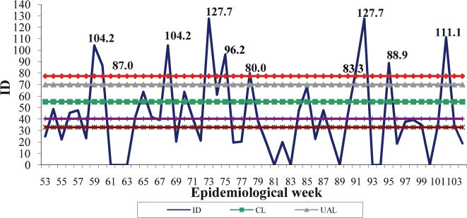
Shewhart Control ChartThe rates for 2004 and 2005 are different, with higher rates in the first year, as shown in Table 2. Figure 1 presents the modified Shewhart chart proposed by Arantes, which used the incidence density rates for 2004 to build the limits. The difference between the rate patterns of the two years could lead to an overestimation of the control limits, which may disguise some periods of deviation from the process mean. Another point of concern was that the chart limits were built by considering points that were out of control during 2004 according to Arantes' proposal. During 2005, ten IDs exceeded the control limits, corresponding to weeks 59, 60, 68, 73, 75, 78, 91, 92, 95, and 102 (Figure 1).
The incidence density rate per 1,000 patients per day in the adult ICU for 2004 and 2005.
| Year | N | Mean | Standard Deviation | Median | Minimum | Maximum | NI number (1) | CV |
|---|---|---|---|---|---|---|---|---|
| 2004 | 52 | 55.11 | 47.03 | 43.48 | 0.00 | 187.50 | 132 | 0.853 |
| 2005 | 52 | 42.45 | 34.70 | 38.10 | 0.00 | 127.66 | 106 | 0.817 |
Source: NICC–CH/UFMG.
NI: nosocomial infections.
The control chart of the incidence densities per 1,000 patients/day in 2005 (Shewhart chart proposed by Arantes). (1) The year 2004 was used as the basis when building the limits. (2) The limit values were as follows: CL = 55.11, UAL = 69.96, UCL = 77.39, LAL = 40.27 and LCL = 32.84. (3) The limits were built based on the Poisson distribution, considering the deviation as the square root of the weekly nosocomial infection incidence average.
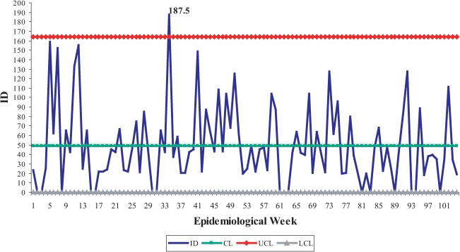
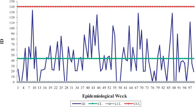
In Figure 2, the results obtained using the traditional Shewhart control chart are presented, where the only period of deviation that was detected corresponds to the 34th epidemiological week of 2004. The control limits in Figure 2 were calculated by considering all available observations, including those observations the values of which were out of the delimited control region shown in Figure 1. For this reason, the limits were adjusted by excluding the sample observations that exceeded the limits of Figure 2, one by one, according to the steps presented in Table 3. By the sixth step, the series of the incidence density rate was under control; that is, there were no observations higher than the UCL. The adjusted control limits for a process under control were 43.13 (CL), 139.62 (upper limit) and zero (lower limit) for a controlled incidence density rate. These limits were more reasonable to monitor nosocomial infections in 2006 (Figure 3).
The control chart of incidence densities per 1,000 patients/day in 2004 and 2005 (traditional Shewhart chart). (1) The mean value of the incidence densities and the module of moving ranges were 48.78 and 43.39, respectively. (2) The limit values were CL = 48.78, LCL = 0, and UCL = 164.19.
The steps used to find the final control limits.
| N° of adjustment | Removed week | Correspondent ID | Year | CL1 | Moving average range | UCL |
|---|---|---|---|---|---|---|
| 2 | 34 | 187.50 | 2004 | 47.44 | 40.98 | 156.42 |
| 3 | 5 | 159.09 | 2004 | 46.34 | 39.47 | 151.32 |
| 4 | 12 | 155.56 | 2004 | 45.26 | 39.42 | 150.10 |
| 5 | 7 | 152.17 | 2004 | 44.19 | 38.00 | 145.26 |
| 6 | 41 | 148.94 | 2004 | 43.13 | 36.28 | 139.62 |
Source: NICC–CH/UFMG.
The control chart of incidence densities per 1,000 patients/day in 2004 and 2005 following the steps presented in Table 3 (traditional Shewhart chart). (1) The mean value of incidence densities and the module of moving ranges were 43.13 and 36.28, respectively. (2) The limit values were CL = 43.13; LCL = 0, and UCL = 139.62.
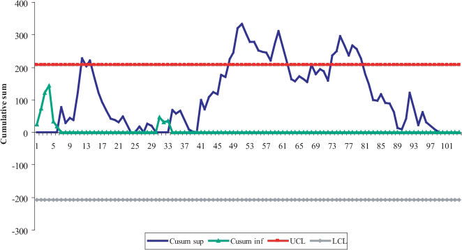
Figure 4 indicates that the incidence density rate begins under control and remains under control until week 12 of 2004, when the incidence density rate is 155.56 per 1,000 patients per day. Immediately after this occurrence, the curve decreases; however, a new, relatively high incidence density rate is observed in week 14, leading to the CUSUM control limit being exceeded. In addition, in 2004, there was a sequence of out-of-control periods that lasted from week 48 until week 52, the last epidemiological week of that year.
In 2005, the out-of-control condition was detected immediately in the first week. This occurrence was likely due to the fact that the ID rates were already out of control in late 2004, and this situation remained until week 10. For week 16, a specific value of the cumulative sum out of control was observed, and from weeks 21 to 28, another sequence of out-of-control periods was observed.
When the process is observed continuously, with no separation by year, a larger sequence of out-of-control periods started in week 48 and lasted until week 62 (15 consecutive weeks). This period corresponds to the time between the end of November 2004 and the second week of May 2005. The process was only under control when two consecutive weeks of incidence density rates were equal to zero.
CUSUM has an explanatory capability that is useful for infection control because it allows one to detect precisely when the period of deviation of the process started. Another great advantage is that this chart provides an opportunity to prevent an outbreak because once an increasing trend period is initiated, actions can be taken to avoid allowing the curve to exceed the upper control limit.
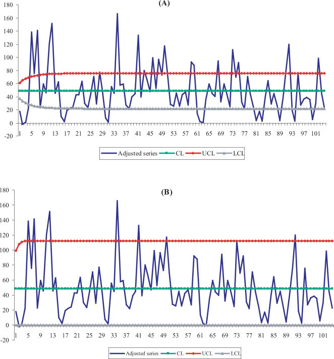
The Exponentially Weighted Moving Average Control ChartIn Figure 5A, with parameters L = 2.814 and λ = 0.10, the sample points over the upper limit correspond to weeks 5, 7, 12, 34, 41, 43, 48, and 50 of 2004 and weeks 7, 8, 16, 21, 23, 40, 43, and 50 of 2005. The EWMA, implemented with parameters L = 2.814 and λ = 0.10, was effective at detecting small shifts in the process mean, on the order of approximately 1σ from the mean.5
In Figure 5B, the EWMA chart that was implemented with the parameters L = 3.054 and λ = 0.40 identified the following weeks with possible deviations in the process mean: weeks 2, 5, 7, 11, 12, 34, 41, and 50 in 2004 and weeks 21 and 40 in 2005. Table 4 presents the atypical points that were detected during the study period, according to all of the control charts presented in this study.
Weeks with atypical points in the years 2004 and 2005 according to the utilized methods.
| Chart | 2004 | 2005 |
|---|---|---|
| 3 – Shewhart proposed by Arantes | 59, 60, 68, 73, 75, 78, 91, 92, 95 and 102 | |
| 4 – Traditional Shewhart | 5, 7, 12, 34 and 41 | |
| 8 - EWMA L = 2.814 | 5, 7, 12, 34, 41, 43, 46, 48 and 50 | 59, 60, 68, 73, 75, 92, 95 and 102 |
| 9 - EWMA L = 3.054 | 2, 5, 7, 11, 12, 34, 41 and 50 | 73 and 92 |
| 10 - CUSUM K = 0.5 and H = 5σ | 12, 14, 48, 49, 50, 51 and 52 | 53 to 62, 68, 73 to 80. |
Source: NICC – CH/UFMG.
The NICC/HC currently makes use of a Shewhart control chart according to Arantes' proposal,3 using the previous year to estimate the control limits of the chart. As observed in Table 2, the incidence density rate means per 1,000 patients per day were not equal for both years. Therefore, Arantes' modification may lead to an overestimation of the control limits in the chart because the pattern behavior of each year varies. As an alternative, a traditional Shewhart chart was built using the entire series of data from both years to estimate the control limits. After adjustment steps were performed (Table 3), more reasonable control limits were found for monitoring the process from 2006. Shewhart charts are effective at detecting larger shifts in the process means, i.e., shifts of two or more standard deviations from the mean. To detect small shifts, the EWMA and CUSUM charts are more appropriate.5
In the CUSUM chart, each value of the cumulative sum depends on the value of the previous sum. Therefore, CUSUM typically detects out-of-control period sequences in addition to specific values. The chart was implemented in this study using K = 0.5 and H = 5σ, which are the recommended values in the literature for detecting shifts of one standard deviation from the process mean. Even though the CUSUM chart had indicated weeks of deviation that were different from those weeks indicated by the Shewhart methods (with and without the Arantes correction), it was able to detect the period of process deviation from the last week of November 2004 until the second week of March 2005, comprising 15 consecutive weeks. The process returned to a situation under control only after the observation of two successive weeks of incidence density rates were equal to zero. CUSUM constitutes an interesting methodology because it follows the process sequence by accumulating the information of the sample points instead of taking each point by itself in the analysis, as is true for Shewhart control charts. CUSUM also provides information about the point of time when the process experiences a shift in the mean, becomes out of control and comes back under control.
The EWMA chart allows the adjustment of autocorrelated processes and is less sensitive to the hypothesis that the data are normally distributed.5 EWMA charts were presented with the sets of parameters L = 2.814 and λ = 0.1 and L = 3.054 and λ = 0.4. The first chart was effective at detecting shifts of one standard deviation from the mean, and the second chart was effective at detecting shifts of two standard deviations from the mean. As expected, the first chart detected a larger number of weeks during which the process was out of control. Because the second chart is effective at detecting shifts similar to Shewhart charts, we expected that it would identify the same weeks of deviation as those weeks indicated by the Shewhart charts, but the results were different. For this reason, an EWMA chart seems to be more effective at detecting small shifts. However, for greater shifts, the Shewhart control chart is preferable. The EWMA chart, with the parameter L = 2.814, detected weeks 43, 46, 48, and 50 of 2004 as being out of control. These weeks were not detected by the Shewhart charts, probably because these particular weeks demonstrated small shifts in the process mean.
The results of this study are useful for controlling nosocomial infections because they present a palette of statistical methods that can be used for this specific purpose. We suggest the use of the entire historical series when building control limits for Shewhart chart. By doing so, influences from atypical years can be avoided in the decision-making process. When the interest is monitoring small deviations in nosocomial infection control, the health services could use EWMA or CUSUM charts.
Currently, it is of critical importance to detect nosocomial outbreaks early. The occurrence of an infection outbreak represents risks to both a hospital and its patients because it can ultimately lead to the shutdown of beds or care units. Before this shutdown occurs, the preventive characteristics of the CUSUM chart could be very useful to the NICC due to the fact that it allows decisions to be made before the curve surpasses the control limit.
It is important to emphasize that all of the charts presented in this study were developed using Excel® software, and therefore, they can be reproduced by any nosocomial infection service that utilizes this tool. Posterior studies using the estimation of control limits by non-parametric methods, such as the empirical distribution function and a kernel estimator,7 can be very relevant. However, because the majority of the nosocomial infection services have no statistician on their professional board, the implementation of more complex statistical methods in routine services is not simple. The development of software that can be adapted to nosocomial infection services may be a possible alternative.
CONCLUSIONSThree charts were used in conjunction in this study: the traditional Shewhart chart, which defines control limits based on the entire historical series; the EWMA chart, with parameters L = 2.814 and λ = 0.1; and the CUSUM chart, which can be a good alternative for detecting nosocomial infection outbreaks because it allows one to identify periods with smaller or larger shifts in the process mean. In particular, the CUSUM chart may lead to the prevention of outbreaks if the data from this chart are communicated to the NICC quickly.
The authors would like to thank Fapemig for the financial support.
No potential conflict of interest was reported.


